Spindrift craft beer
Logo Design / Bottle Label
The brief for this design was a logo and bottle label for a fictitious spinach craft beer company called Spindrift. The client had a very specific idea for the logo design, and gave a detailed description of his desired outcome including arced text and three concentric circles surrounding the text in varying shades of green.
As the client had a specific idea in mind for the final design I only did a small amount of initial research, instead focusing primarily on recreating the client’s description of the desired logo as closely as possible, although I did consider the possibility of alternate designs.

Initial Research
My initial research mainly consisted of collating colours, fonts, and a variety of iconography relevant to the word Spindrift and craft beer as a product respectively.
I explored the possibility of different approaches to the product, and whether to approach the brief as an old-fashioned design, a modern one, or a mix of the two.
I also compiled several notes on existing designs for craft beer packaging and logos, taking into consideration the embellishments used in the more old-fashioned designs, as well as the possible nautical iconography stemming from the product name.


First Design Draft
The first design I created incorporated the “Fat Cow” typeface mentioned in the client’s brief, with arced text and two concentric circles (I initially thought that three circles so close together made the design too ‘busy’).
I made the creative decision to attach the lower half of the outer circle to the text, creating a sweeping motion in-keeping with the name of the product and its connotations with strong winds. I also added a subtitle following the curve of the main text, as the product the logo is meant to represent is not immediately apparent.
Second Design Drafts
After sending off the initial design draft to the client, I received two requests for alterations, these included;
- A request for the main text to remain perpendicular on the vertical axis, instead of strictly following the horizontal curve in the same arc
- A more elongated ‘slight-serif’ font
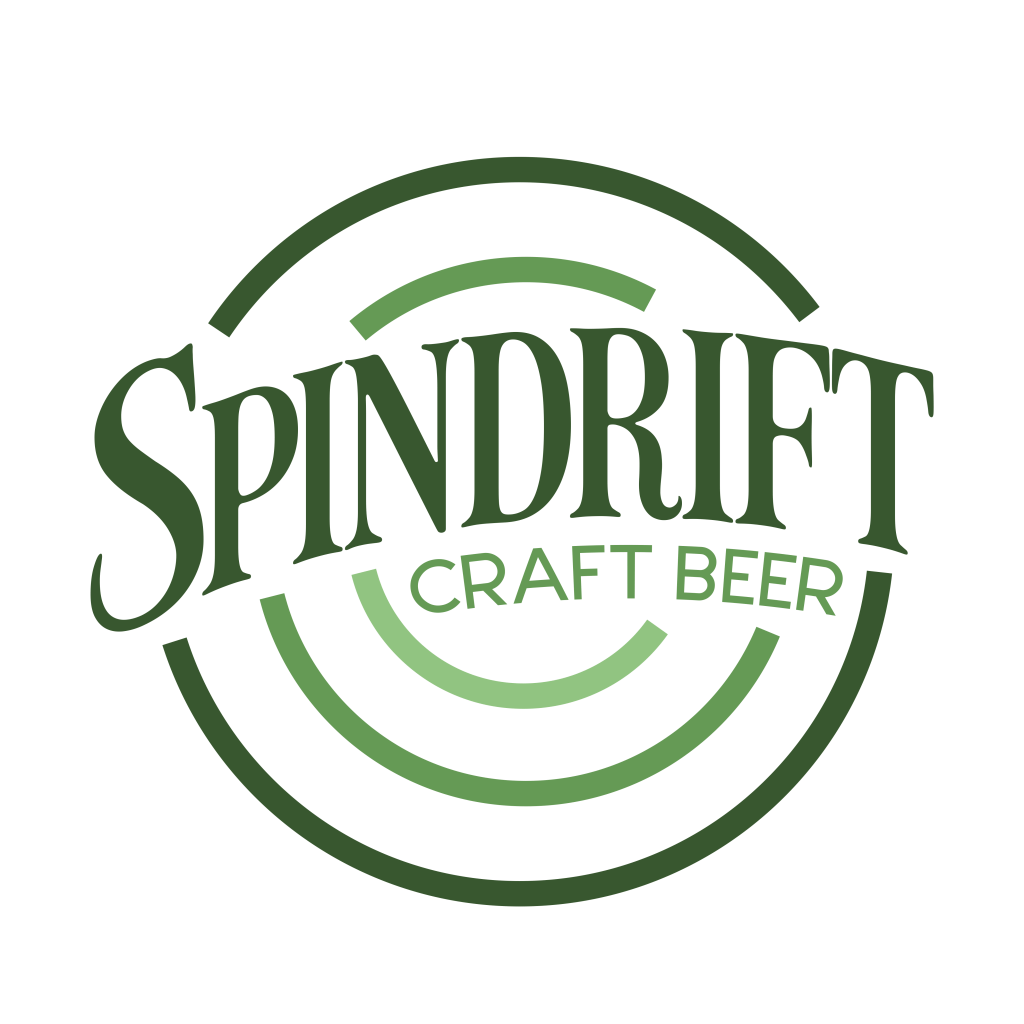
As a result of these requests I produced two second drafts, one variant in the original “Fat Cow” font as well as a second in the serif font “LT Carpet” both now making use of the perpendicular text following the same arc as the first draft.
In the second of these designs I changed the line width of the circles as I felt such thick lines didn’t match the comparably thinner stroke width of the serif font. This, however, resulted in a lot of empty space in the design, so I added a third circle to the logo to make better use of the space.

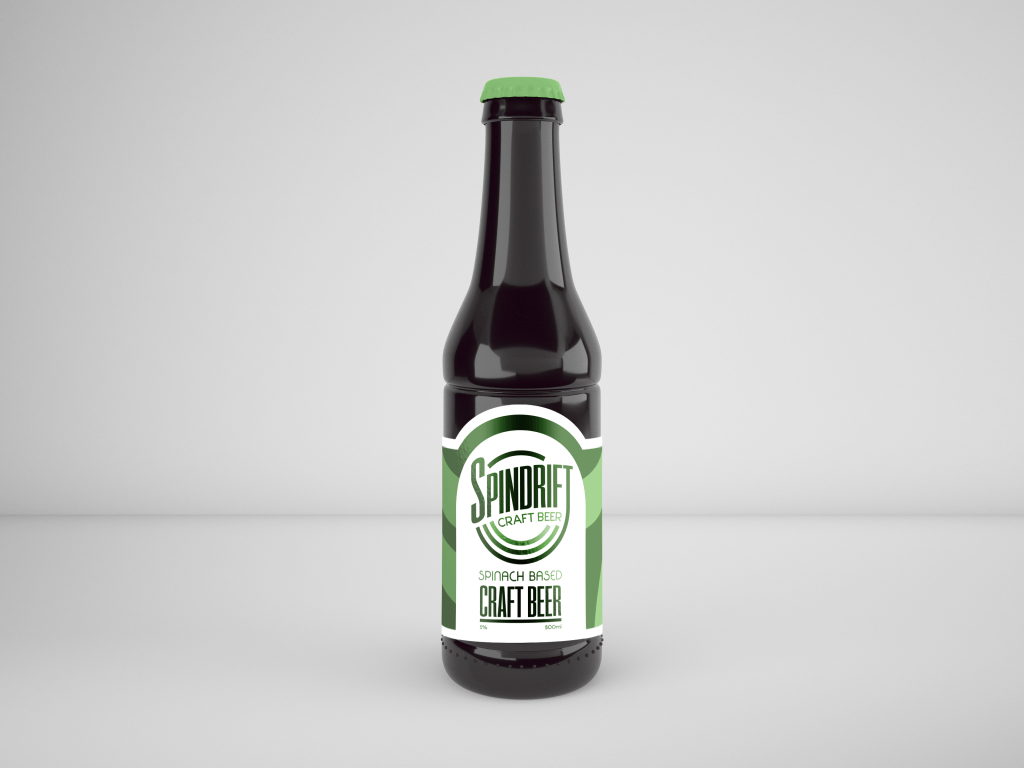
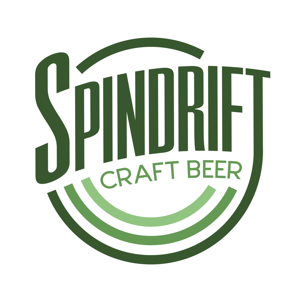
Final Logo and Bottle Design
When shown the two variants of the second design draft, the client chose the first “Fat Cow” version. I retained all features of the draft for the final design, but added a third line inbetween the existing two to take out some of the empty space.
For the bottle label, I drew inspiration from the more minimalistic label designs I had explored in my initial research, using broad sweeping curves in the background to help support the design elements of the logo. I initially considered using an all-white version of the finished logo instead of the original green version, but instead opted for an elongated while circle with the same curve as the logo to use as a backdrop.