shoreditch press
Logo / stamp design
The client for this brief wanted a logo and stamp design for an arts and crafts shop, selling custom cards. She specifically requested a logo reflecting the art style of Charles Rennie Mackintosh and the Art Noveau design movement.
As the logo would also be used as a stamp for stamping cards sent out by the company, it needed to be highly legible with a relatively thick stroke width, as well as have compact formatting in a rectangular shape.

Initial Font Selection
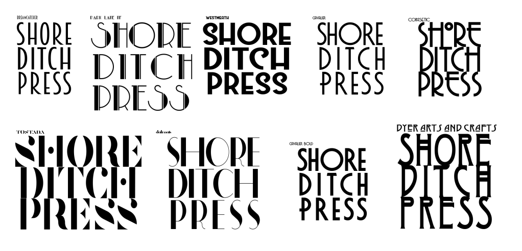
As per the brief, I collated 9 fonts in-keeping with the Art-Noveau movement and arranged each of them in a square to showcase what they would look like if they were to be used in the final design.
I showed them to the client and she selected the two fonts that she liked the most.
Design Drafts 1 & 2
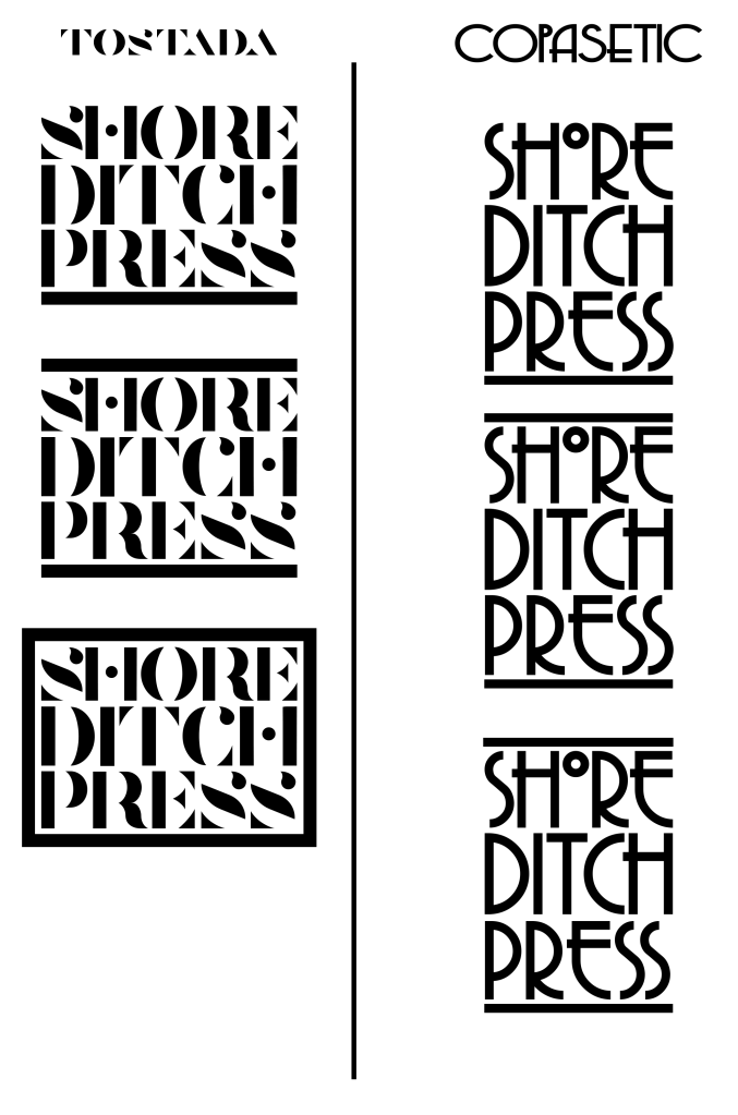
The client chose the “Tostada” and “Copasetic” typefaces as potential fonts for the final design which I proceeded to re-adjust in order to make the boundaries of the square level.
I also experimented with the placement of lines to better define the stamp borders, matching the line thickness to the stroke width of the typeface. I arranged these lines in various formats (Below the text, above and below the text, and completely encasing the text). I found that the lines surrounding the text on the “Tostada” version looked better, and the lines above and below the text better suited the “Copasetic” typeface.

Final Logo and Stamp Design
When shown the “Tostada” and “Copasetic” variants of the logo, the client selected the latter, referencing the similarities to Charles Rennie Mackintosh’s signature style.
In order to better fill the space to make for a better stamp design, I extended the outer line of the “H” down, to fill in the gaps in the logo.
The client purchased a stamp design based on the final logo and noted the “hand-made” appearance of the stamp design after it was transferred onto the paper, supporting the branding of the company as a hand-made arts and crafts shop.
