Ms.Josephine’s hand-painted harmonicas
Logo / stall banner / harmonica box label / etsy banner
The client for this design is a local online store owner, selling custom hand-painted harmonicas on her Etsy page. The initial brief I received requested a new logo design as well as a stall banner for local craft fairs measuring approx. 120cm x 40cm, I had to take these measurements into consideration for the final logo design in order to ensure there wasn’t too much empty space on the wide banner.
The brief went into great depth concerning the client’s expectations for the final design. A design reminiscent of antique newspaper advertisements from the 1910s was requested, as well as the specific requirement to not use “Art Deco” typefaces in the final design.

Initial Planning – Fonts
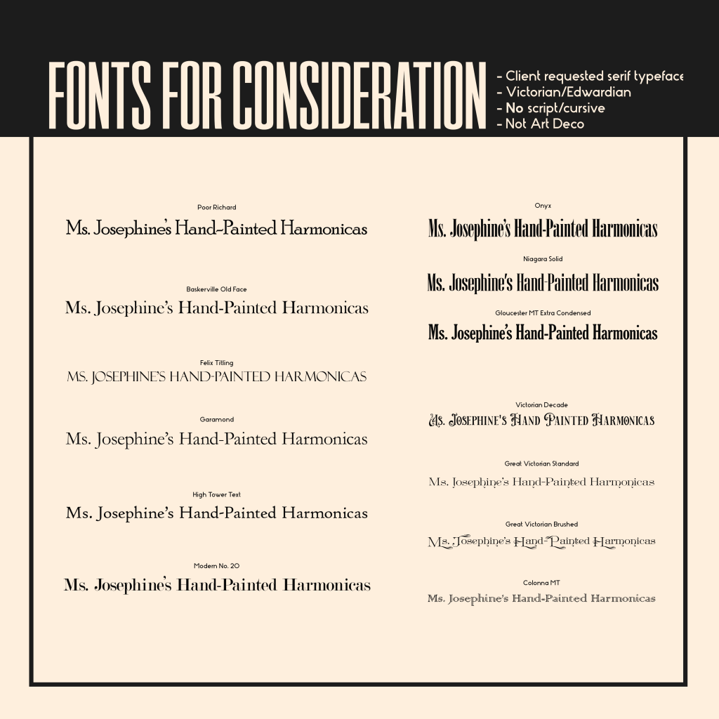
For the first stage of design planning I compiled 14 fonts for the client to consider for the final design, all of them stylised old-fashioned serif typefaces as per the brief.
As similar designs from the design era included in the brief incorporated several different fonts to denote product title, headings, subheadings etc, I sorted the typefaces into 3 distinct groups based on their line-widths and legibility as I intended to use one of each in the final design.
The client had specifically requested use of the “Poor Richard” font in the brief, and when shown the collection of fonts, selected “Onyx” and “Victorian Decade” as typefaces she would like to see in the final design.
Initial Planning – Inspiration
I then compiled several newspaper advertisements and bottle labels from the time period mentioned in the brief to find common design techniques from the era.
I noticed a substantial use of arced text in various different designs I gathered, as well as frequent use of embellishments around the text to create a more elaborate design. Most designs for advertisements sought to utilise as much of their allocated space as possible, and arched their text accordingly, filling any blank spaces with taglines and product details.
Due to the age of the examples I had selected, many had substantial visual wear-and-tear, which the client had mentioned as a possible stylistic choice for the final design in the brief.

First Draft
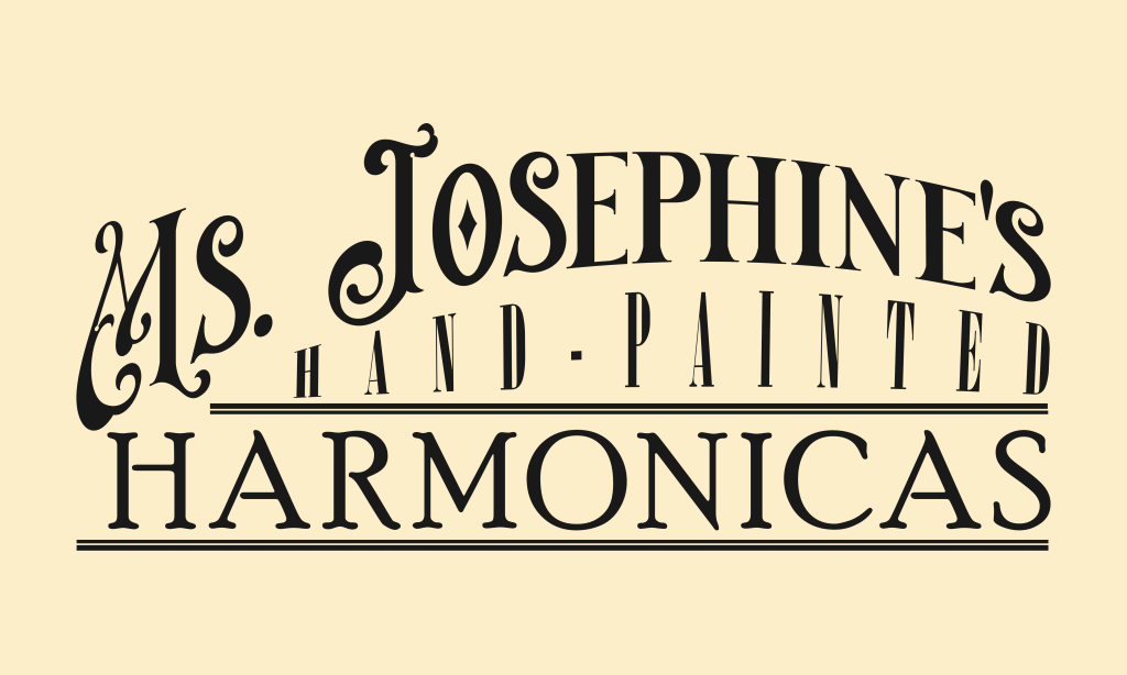
For the first draft I utilised the arched text found in most designs from the time period, also using a cursive typeface for the name to make it somewhat resemble a signature and create the illusion that it was designed by hand. I had to create a wave pattern for the next line of text, ensuring it fit under the the arched text above, while also providing a straight line at the bottom to compliment the embellishments.
As the client had requested use of the “Poor Richard” typeface in the brief, I used it for the product name in all caps, drawing attention to the product the store is selling, as well as surrounding it with a double stroke embellishment.
Final Designs
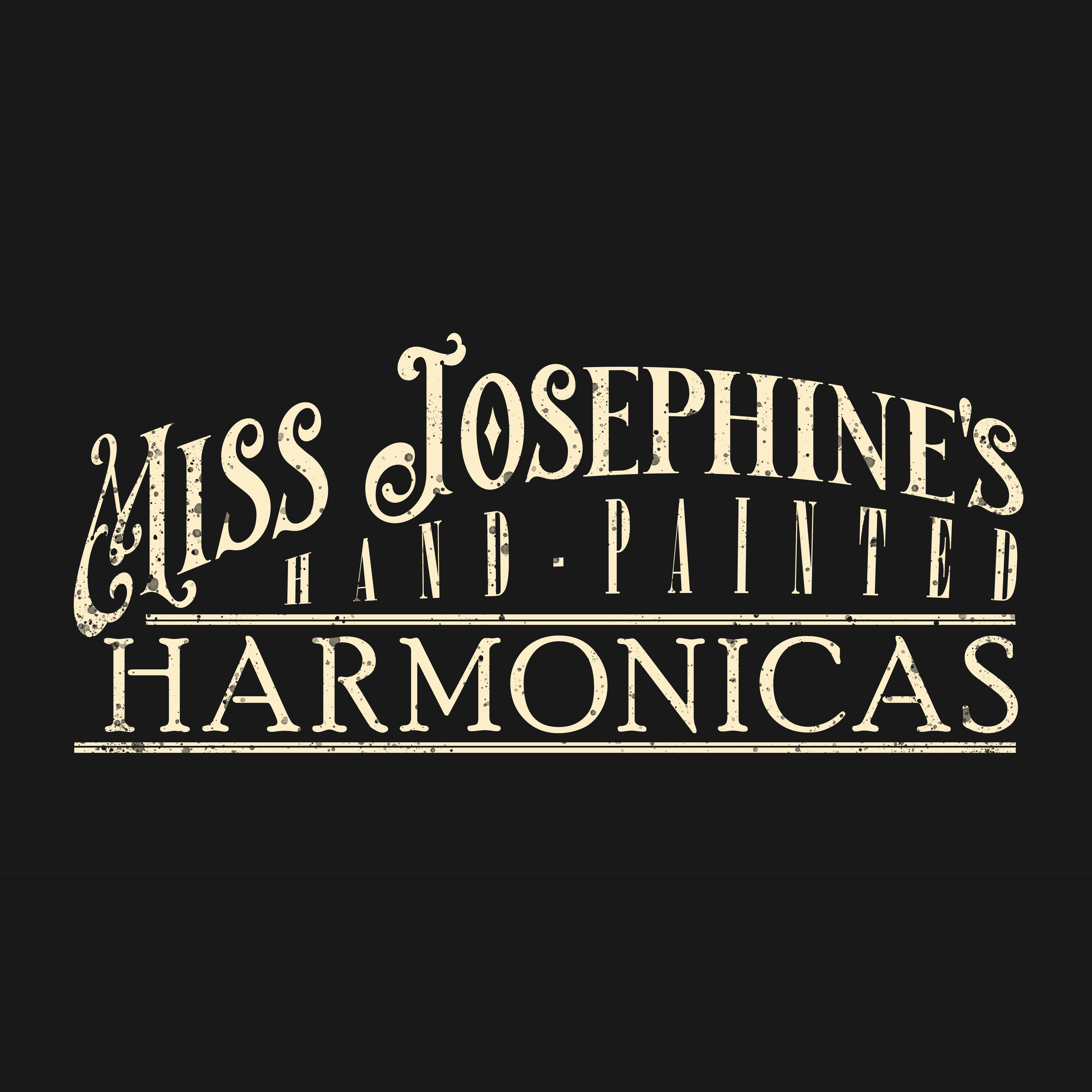
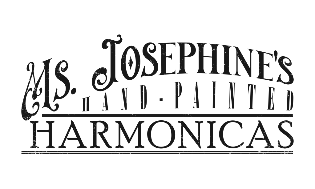
After sending the initial draft to the client, she requested the change of the abbreviation “Ms.” to “Miss”, so I re-adjusted the text spacing to fit the two extra letters. I also added a clipping mask on top of the text and shape layer, painting over it with a droplet brush to give the design a more aged and worn appearance, and extended the top embellishment line to better fit under the “M” in Miss.
For the thumbnail logo for the Etsy page, I was initially concerned about its legibility at a small resolution, but when it was added as the icon to the Etsy page the legibility was sufficient. I inverted the colour scheme to provide a contrast with the banner as the icon was positioned directly in front of it.
For the banner I adjusted the aspect ratio to perfectly fit the banner dimensions, adding wear-and-tear around the border with the same droplet brush to frame it better on the website.