epping forest honey
honey jar label
In 2021 I aimed to redesign the packaging for a local honey company, producing honey from bees based in the historic Epping Forest. I sought to make the packaging slightly more modern, as the initial packaging was very simple.
I attempted two different approaches when designing the label, utilising various different design techniques in each.

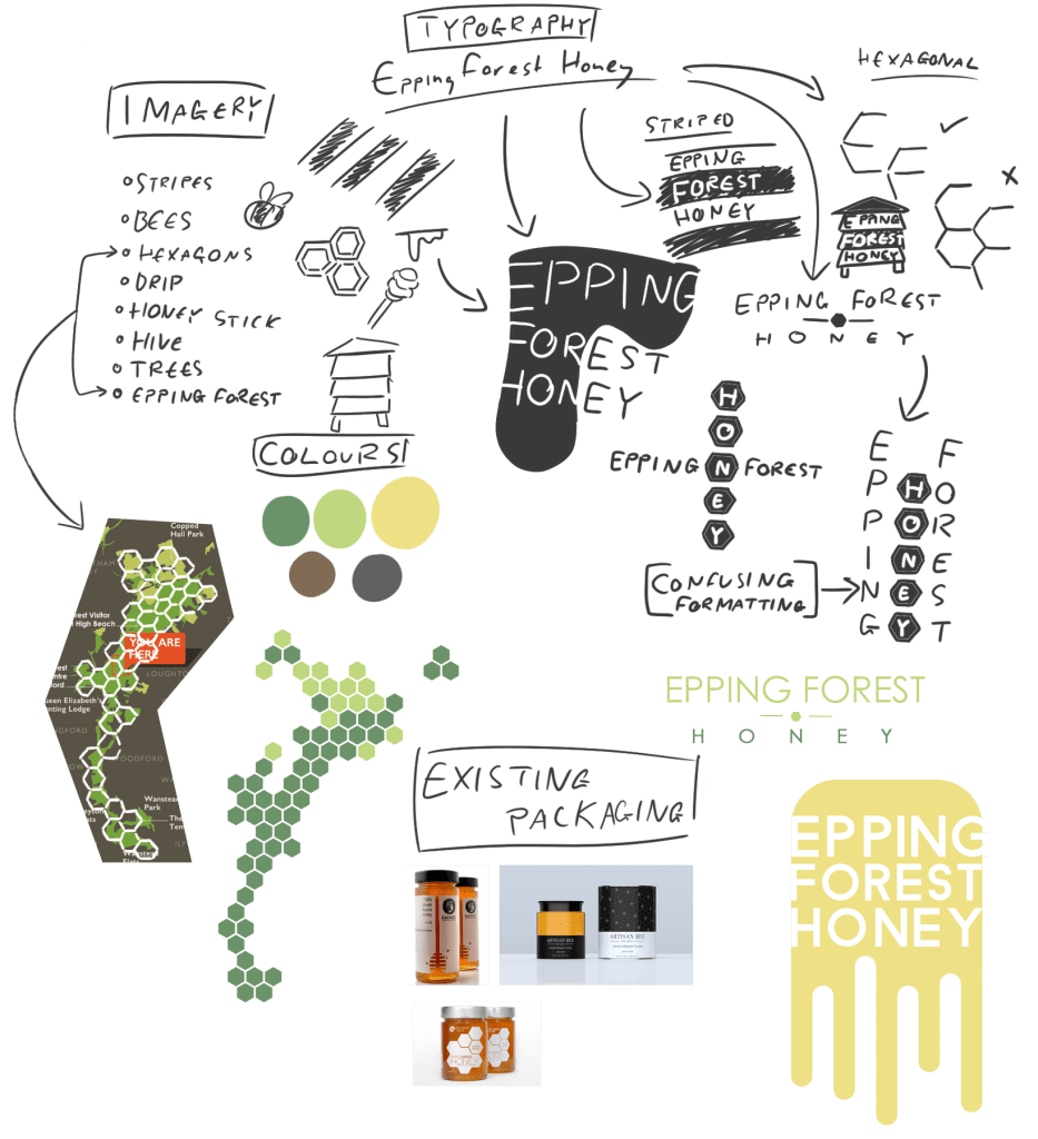
Initial Brainstorm
My initial brainstorm consisted of existing designs that inspired me, various imagery associated with both honey and Epping Forest, and possible typography to use in the final design.
The modern packaging that I selected as inspiration made use of negative space, a stylistic technique which also helped showcase the quality of the product in the transparent glass jar.
I prepared several intial sketched ideas of possible designs, before picking two that I liked most and decided to refine them further.
Design Proposal 1
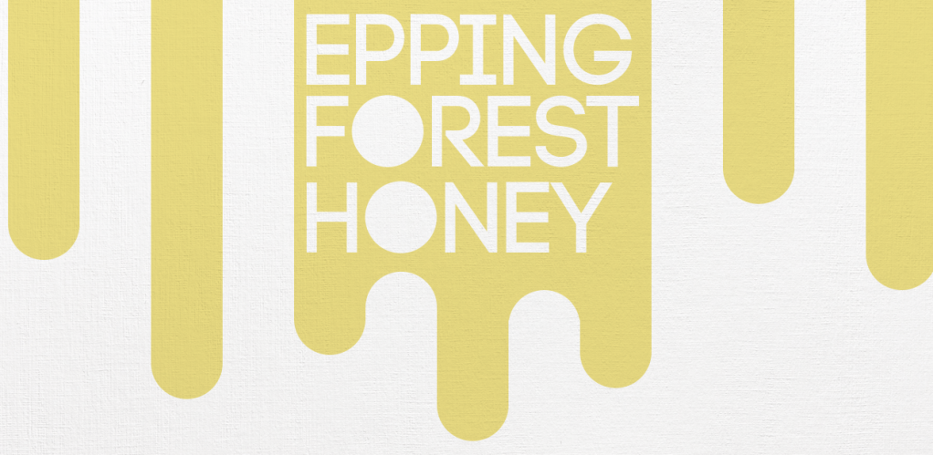
The first of these designs mainly used negative space, as well as the imagery of thick dripping honey. As it was a more modern design, I made the drips thicker and uniform, in-keeping with the thick stroke width of the typeface I had selected.
I also made the stylistic choice to fill in the two “O”s in the text, as they exactly matched the width of the drips, and made the design more uniform and cohesive.

Design Proposal 1 Mockup
I further refined this design concept, removing the yellow colouring and replacing it with a transparent label, showcasing the colour of the honey similar to the existing products I had researched in the brainstorm.
I also changed the solid “O”s I had created into shapes resembling the end of a honey stick, as I felt that the design lacked any distinctive honey iconography.
Although I felt this design stands up as minimalistic honey packaging, it lacks any imagery linked to the local area from which it is based, which I believe is detrimental to the branding of a local company as it makes it seem more corporate.
Design Proposal 2
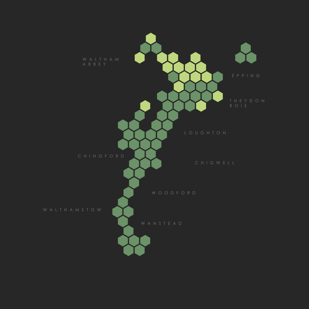
For the second design possibility I explored, I created a hexagonal map of Epping Forest, shading forest land and buffer lands in two shades of green. I also added the location of the hives on the design where they would be positioned on a map.
I felt that this design was a strong base for the final packaging design, emphasising the locality of the company, and tailoring the brand to a specific design rather than a more generic one.

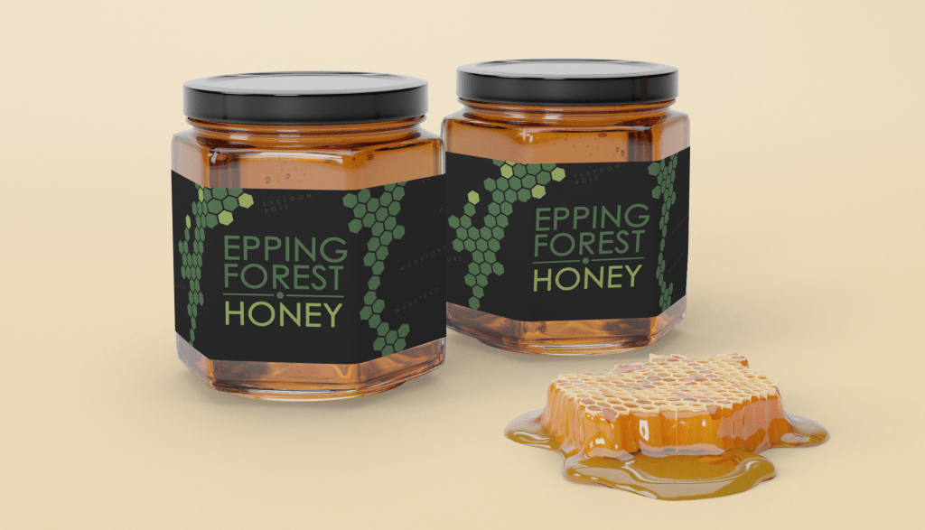
Second Draft
I then duplicated the hexagonal forest map and placed them at a slight tilt in order to make the final design less rigid. The text I placed matched the colours used in the map to give the design more cohesion.
I found the text on this design was not very legible when placed onto a mockup jar, so I adjusted the text to be larger for the final design.
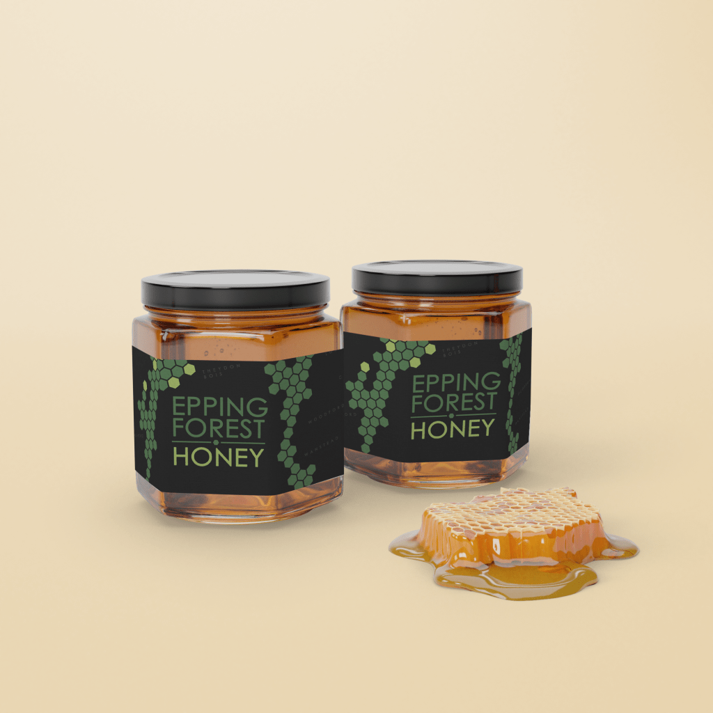
Final Design Mockup
After adjusting the text size to better use up the empty space in the middle of the jar and increase legibility, I had the completed design.
The hexagonal map of the forest frames the text well and ties in nicely with the local area in which it is produced, referencing local towns in the vicinity of the forest where the honey is sold.